
Frank Lloyd Wright Building Conservancy’s New Mission-Driven Logo
“Form and function should be one, joined in a spiritual union.”
- Frank Lloyd Wright
If you’ve read my work before, you know my core belief: everything an organization does must be led by its mission. Not just programming or messaging, but governance, finance, partnerships, public engagement, and everything else. All of it advances the mission, and that work begins long before a word is read. It begins with what people see first. It begins with the logo.
That’s why the Frank Lloyd Wright Building Conservancy’s newly launched visual identity matters. This is one of the clearest, most emotionally resonant expressions of mission I’ve seen in a logo. Not because it nods to Wright’s legacy, but because it makes the stakes visible. The mark expresses the profound loss that occurs when even one Frank Lloyd Wright building disappears forever.
Visiting a Frank Lloyd Wright–designed building is a transformative experience. Each structure demonstrates better ways of living that have been shown to improve not only mental wellbeing, but physical health as well. Learning from them reveals how Wright and his clients lived better lives, while also offering ideas we can bring into our own, living more deeply connected to nature, to beauty, and to loved ones.
When we lose even one of these sites, to natural disaster, neglect, or demolition, we lose more than a structure. We lose the opportunity to experience it, to learn from it, and to carry those ideas forward. That loss is permanent.
This is where the Frank Lloyd Wright Building Conservancy comes in. Founded in 1989, the Chicago-based nonprofit exists to facilitate the preservation and stewardship of the remaining built works designed by Frank Lloyd Wright, both public and privately owned. Over time, the Conservancy has become a central force in the Wright ecosystem and in the broader preservation community, supporting individual stewards while advocating for Wright’s body of work as a whole.
Yet for an organization doing work of this urgency and impact, its visual identity no longer fully reflected the clarity and purpose of its mission. To protect Wright’s legacy into the future, and to reach new audiences who will carry that work forward, the Conservancy needed an identity that could communicate what was at stake immediately, without explanation.
Brooklyn-based design office Order ultimately took on what felt, at times, like a nearly impossible challenge. I helped bring Order into the project and supported the Conservancy as an adviser throughout the process, helping articulate the mission, the stakes, and what this identity needed to communicate. I’ll never forget the first time Order presented the core concept. It hit me like a punch in the gut.
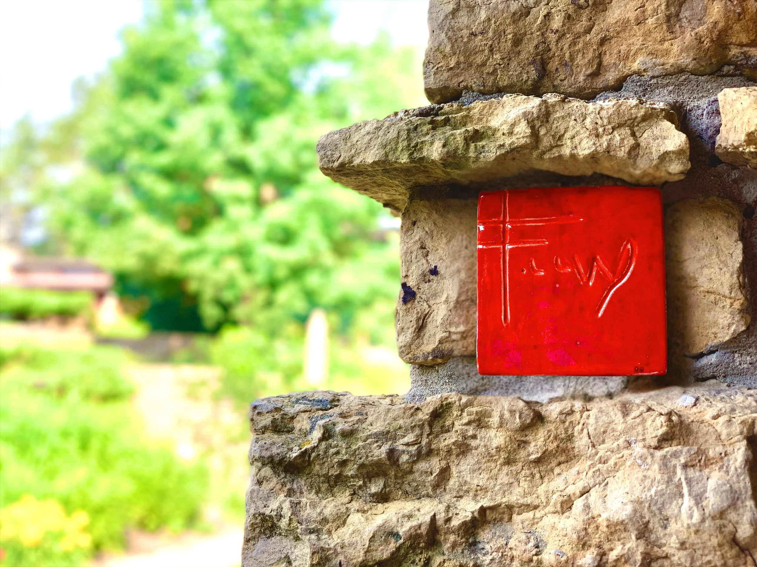
Frank Lloyd Wright frequently used a square as part of his brand identity, most notably in the red tile he used as a signature on some of his buildings. Over time, many Wright sites and organizations have adopted variations on the square in their visual identities as a way of referencing that legacy. Order built on this shared visual language by treating each square as a representation of a Wright site, a steward, or a supporter, individual parts of a larger community brought together by the Conservancy.
What makes the new logo so powerful is what’s missing: one square.
Its absence is not decorative. It represents the void created when a Wright building is lost. It makes loss visible. It transforms preservation from an abstract idea into something you can feel in your gut. The logo doesn’t ask you to admire Wright’s architecture. It asks you to understand what disappears forever when we fail to protect it.
This is more than a logo you can see. It’s a logo you can feel.
Courtesy of Order
Louis Sullivan, Wright’s mentor, famously said, “form ever follows function.” Wright pushed back, insisting that form and function are one. In his work, nothing is ornamental for ornament’s sake. Every detail is beautiful because it serves a purpose. That idea is visible in every Wright building, and it’s a big part of why his work endures.
That same principle is at work here. The Conservancy’s new logo is a striking image, even in its simplicity, but its form is inseparable from its purpose. It communicates the organization’s mission with clarity and conviction, telling the story of what the Conservancy does and why it matters in a single glance. That is form and function working together, in the legacy of Frank Lloyd Wright.
Congratulations to the Frank Lloyd Wright Building Conservancy, especially Digital Engagement & Communications Manager, Eric Rogers, on the launch of a powerful new visual identity. And sincere thanks to the team at Order, Garrett, Jesse, and Megan, for taking on a challenge that genuinely felt impossible, and delivering a solution that exceeded my expectations.
I’ve barely touched on all that goes into the new visual identity system. To explore the work further:
Frank Lloyd Wright Building Conservancy’s announcement →
Order’s case study →

Jeff Goodman is a nonprofit consultant specializing in helping arts organizations clarify their mission and amplify their impact. A former professional actor, he brings a creative approach to his consulting, enabling organizations to tell compelling stories that resonate with audiences and build lasting support. His signature program, Mission Critical, emphasizes collaboration and is dedicated to making the arts accessible, engaging, and exciting for all.